Pages#
A visual walkthrough of the main screens in a Helpbuttons Network. Screenshots are taken from a live community network — "Vecinos del Campillín" — used as an example.
User pages#
Home#
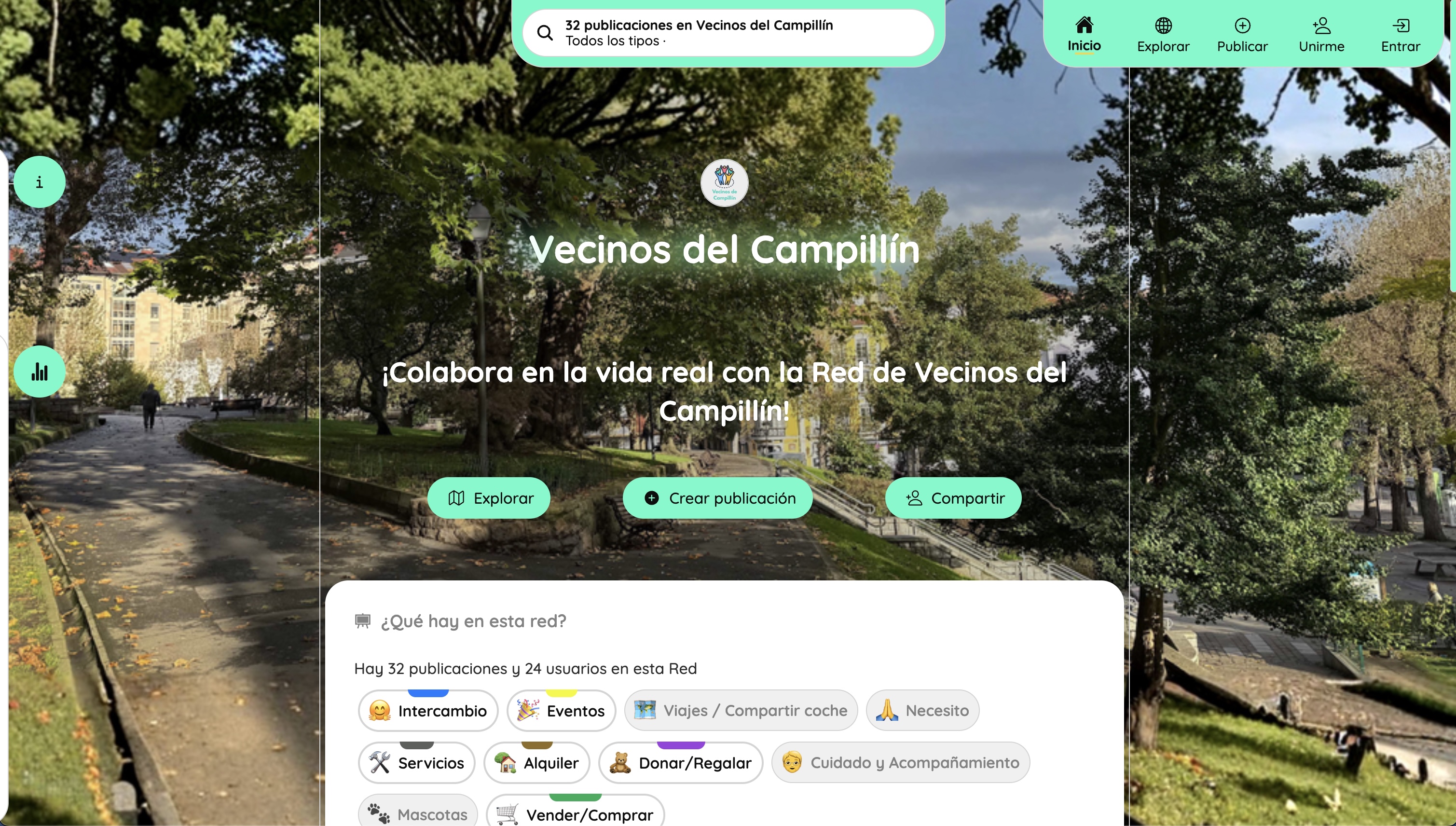
The top of the home page shows the network's name, tagline, and background image — all set by the coordinator. Three main actions are always visible: Explore, Publish, and Share. Below the hero, a summary card shows how many buttons and users are active, followed by all available button types as quick-access chips.
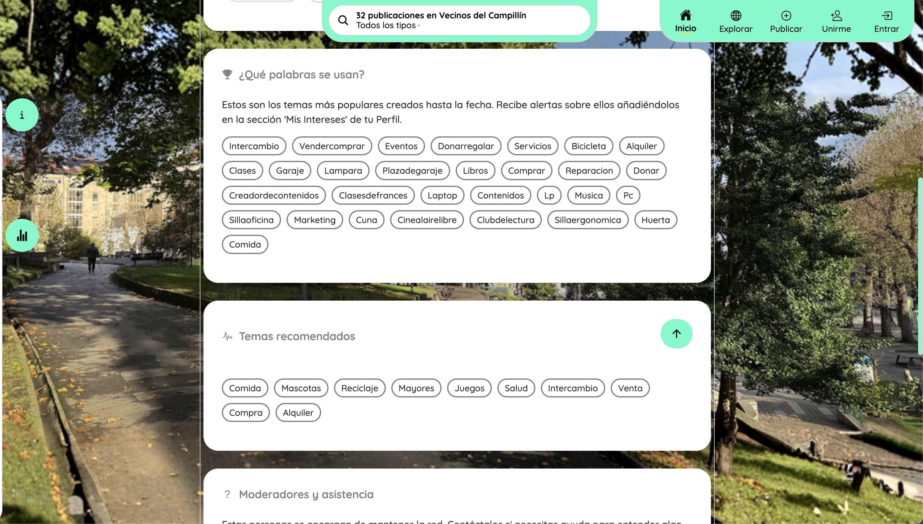
Scrolling down reveals the most-used tags across the network (useful for discovering what topics are active), the coordinator's curated list of recommended tags, and a section showing the coordinators and assistance contacts. First-time visitors use this page to understand what the community is about before registering.
Explore#
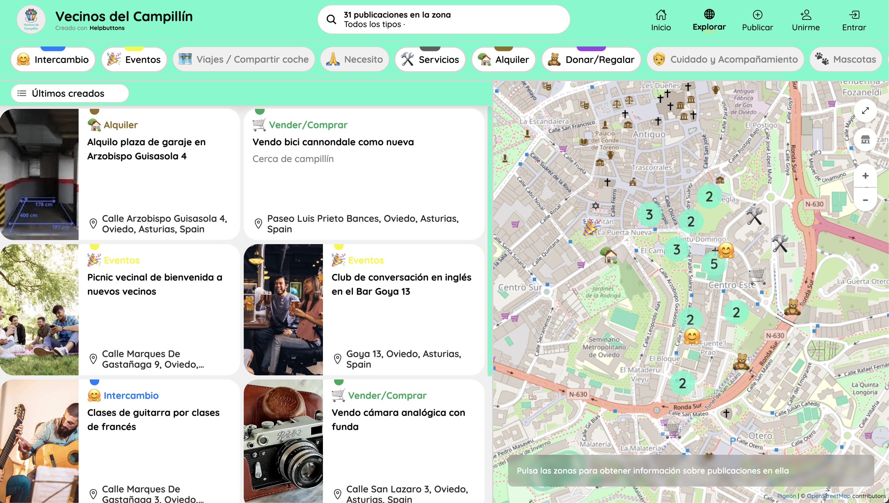
The main view of the Network. Buttons appear as pins on the map and as summary cards in a list alongside it. Button type filters are pinned at the top, allowing quick narrowing by category. Clicking a zone on the map expands the buttons in that area. The URL encodes the current map state, making any view shareable as a direct link.
Filters#
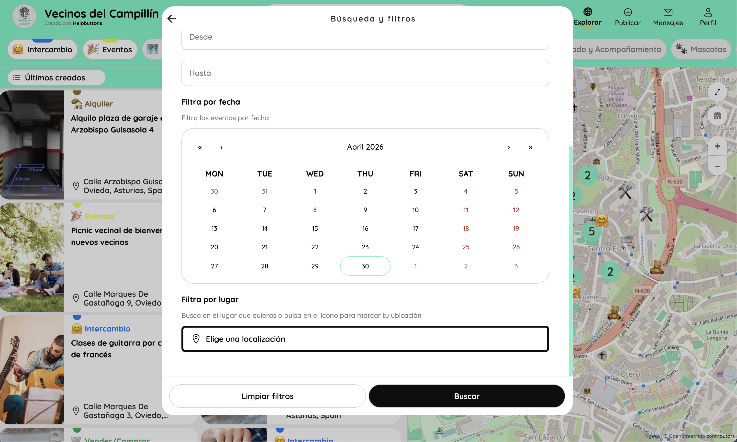
An overlay panel accessible from Explore. Users can filter buttons by date range (with a calendar picker), by location (search or drop a pin), or combine both. Filters apply to both the map and the list simultaneously.
Publish a button#
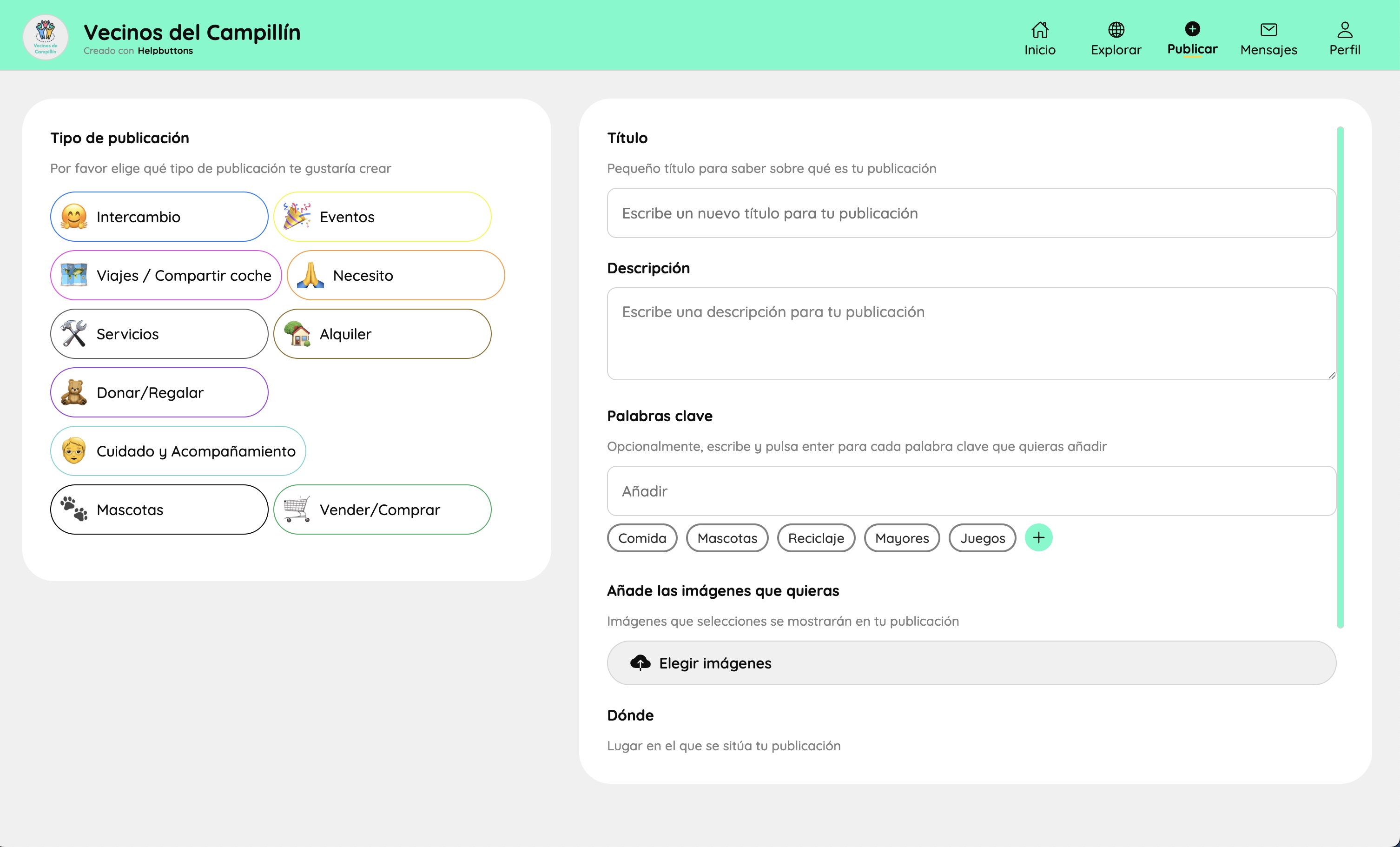
The button creation form. On the left, the user selects the button type — each type has a custom icon and colour defined by the coordinator. On the right, the standard fields: title, description, keywords (tags), images, and location. If the selected type has extra fields (date, price, etc.) they appear in this same form. The location field opens a map picker for precise or approximate placement.
Button detail#
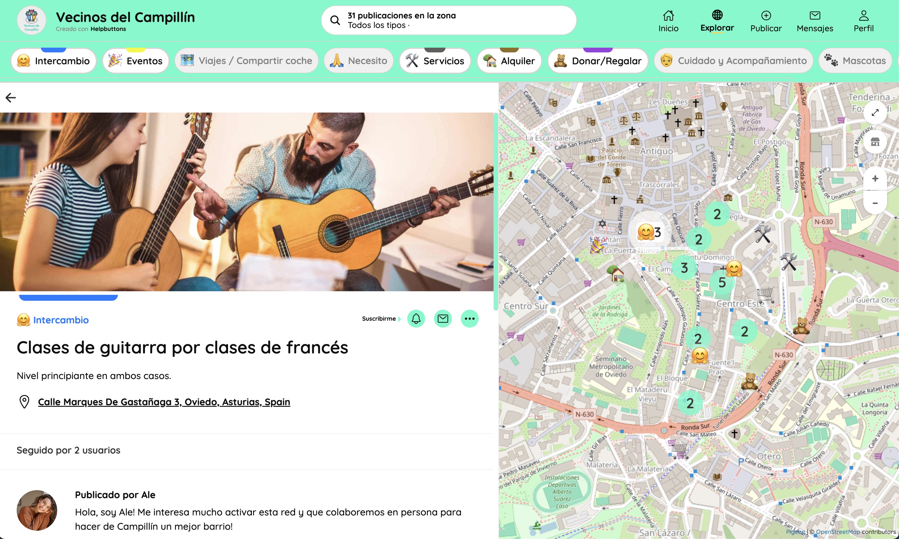
The full page for a single button. Shows the button's image gallery, title, type, location, follower count, and the author's first message. The map remains visible on the right side, keeping geographic context. Users can follow the button to receive updates, message the owner, or leave public comments in the feed.
Messages#
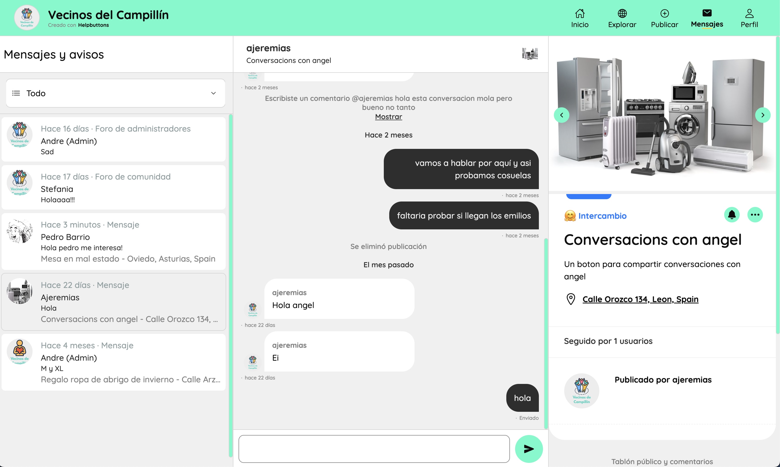
Three-panel messaging view. The left column lists all conversations — private direct messages, system notices, the community forum, and the coordinator forum. The centre shows the active thread. The right panel displays the button card when the conversation is linked to one. Private conversations between users are fully separate from button feeds and visible only to the two participants.
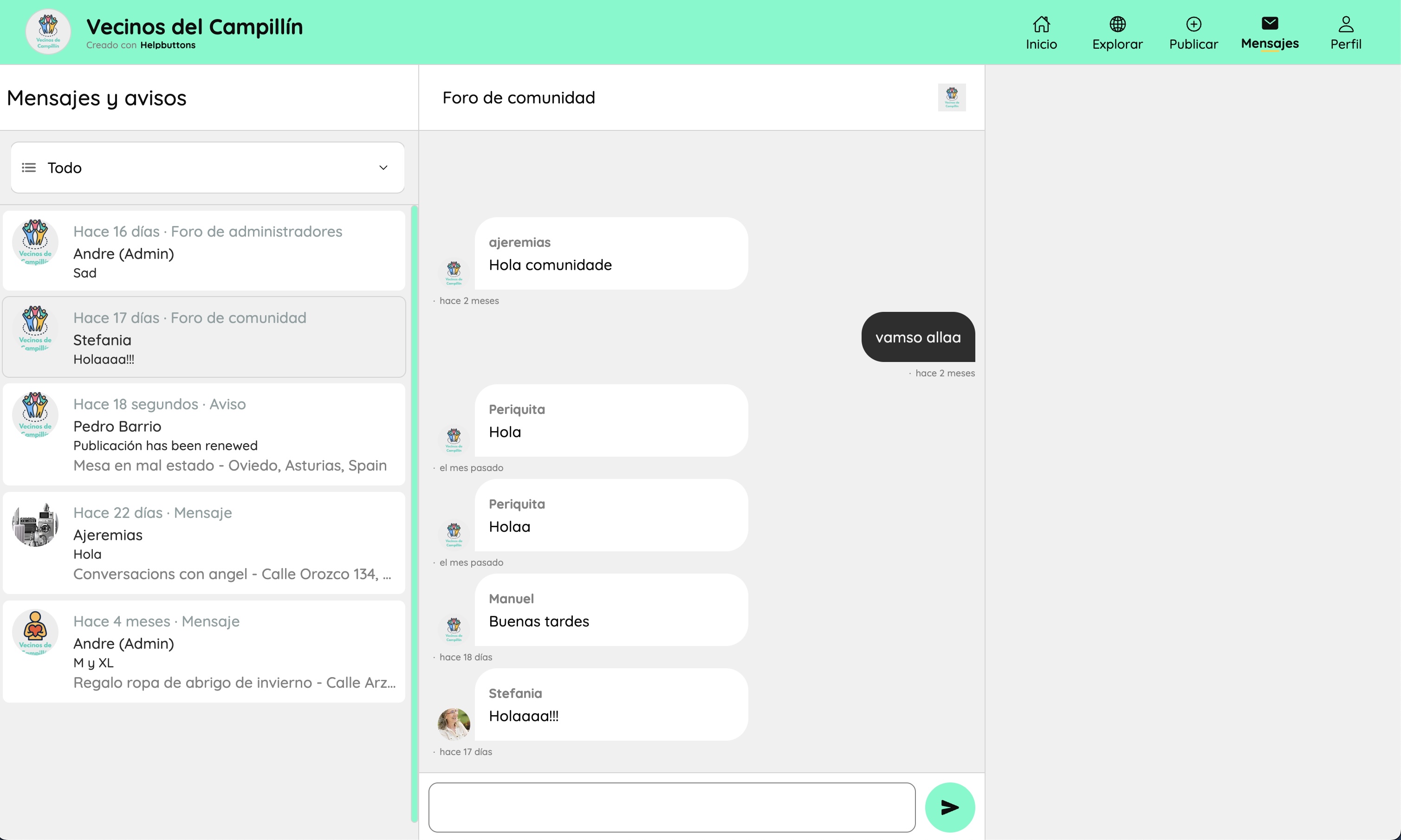
The community forum thread is a shared group chat open to all members of the network, independent of any specific button. Useful for general announcements, questions, and community conversation. The coordinator forum works the same way but is restricted to coordinators.
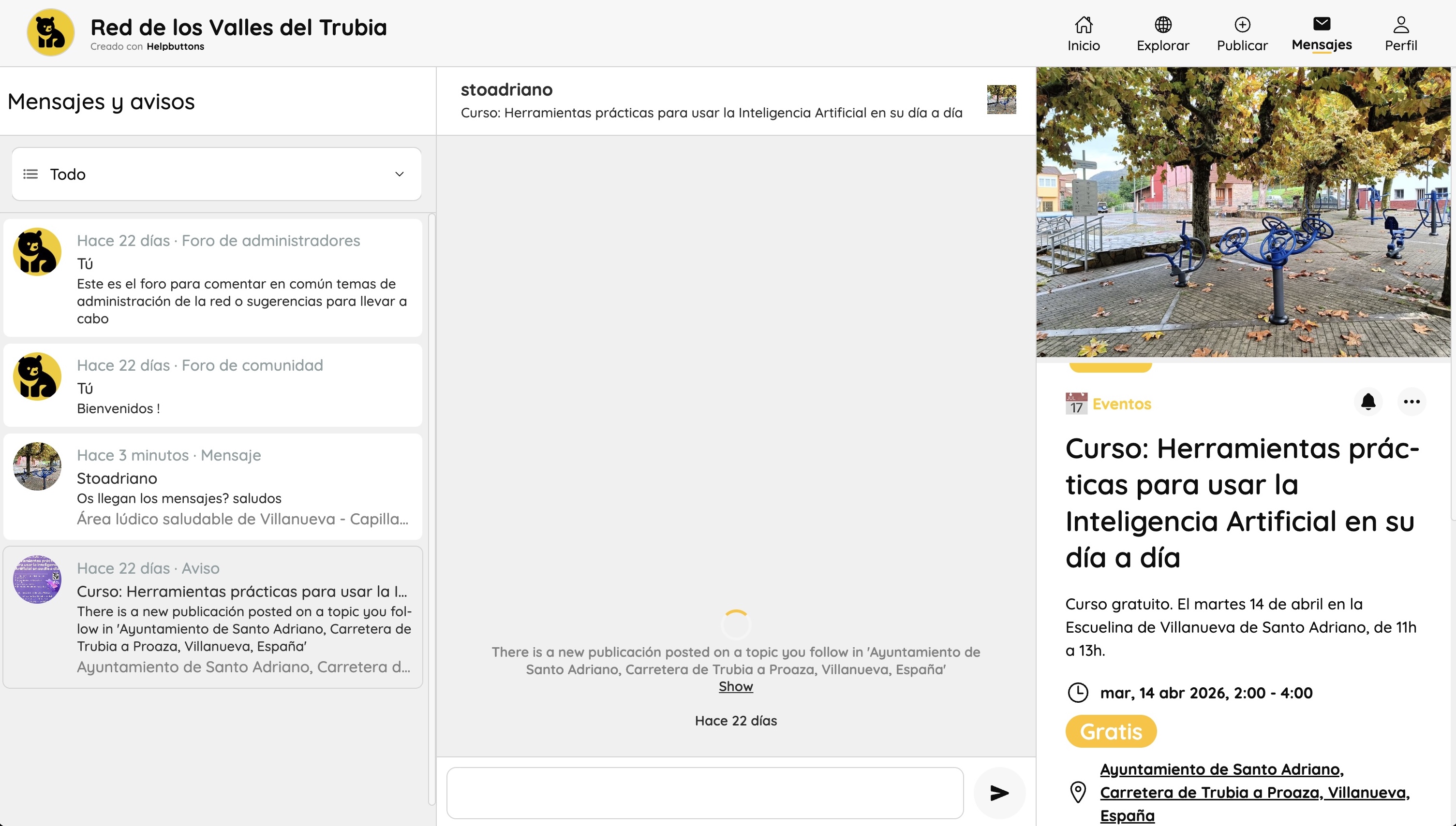
The messages inbox also surfaces system notices (avisos) — automatic notifications such as button renewals, tag subscriptions firing, or new followers. When a notice is about an event button, the right panel shows the full event card including date, time, location, and price.
Profile#
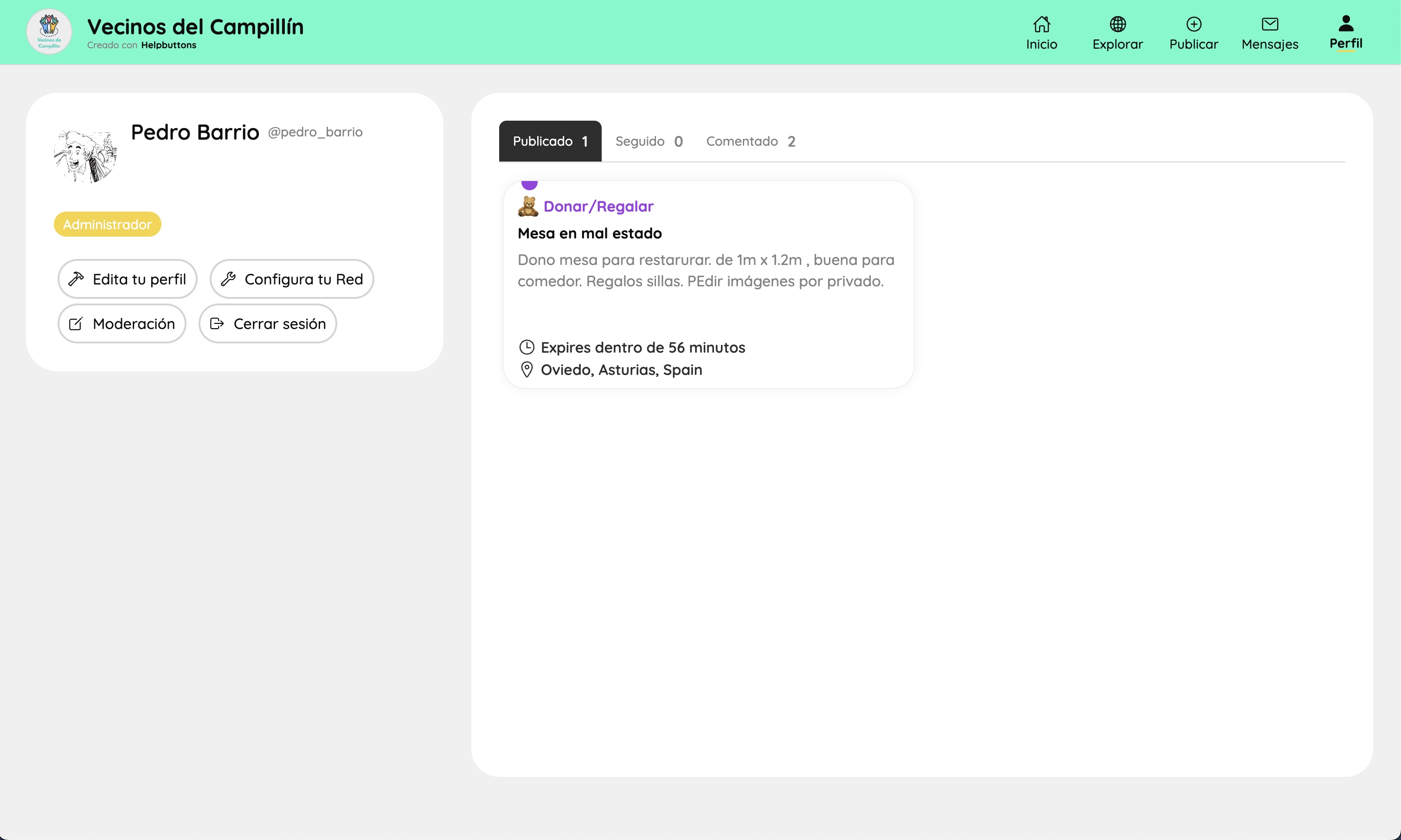
The user's public profile page. Shows their name, username, role badge (e.g. Coordinator), and tabs for published, followed, and commented buttons. Coordinator users see quick-access buttons to edit their profile, configure the Network, access moderation, and log out.
Share and community integration#
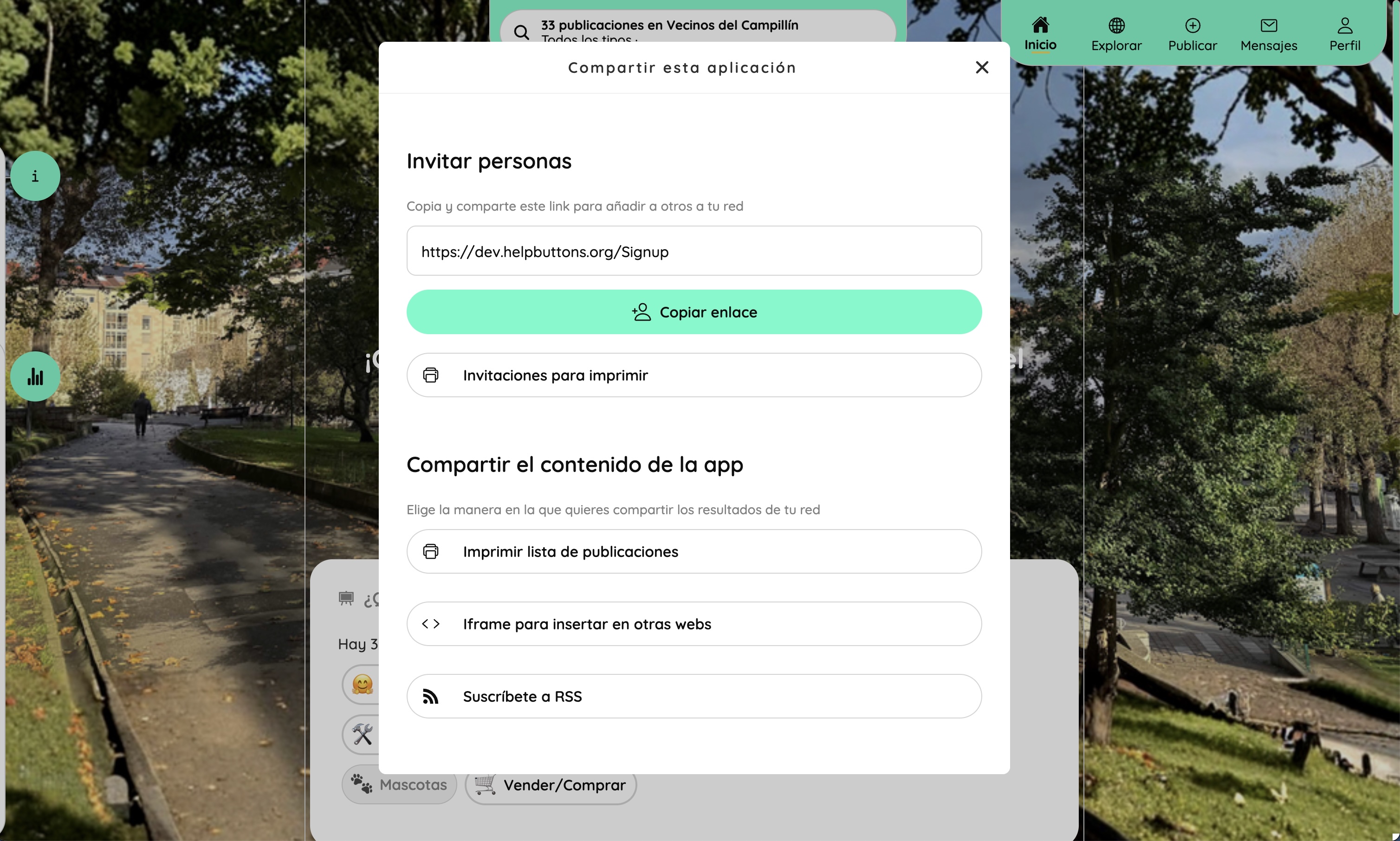
The sharing panel, accessible from the home screen. It provides two groups of actions:
Invite people — copy the registration link, or generate printable invitation cards with QR codes that people can scan to join the network directly, without needing to know the URL.
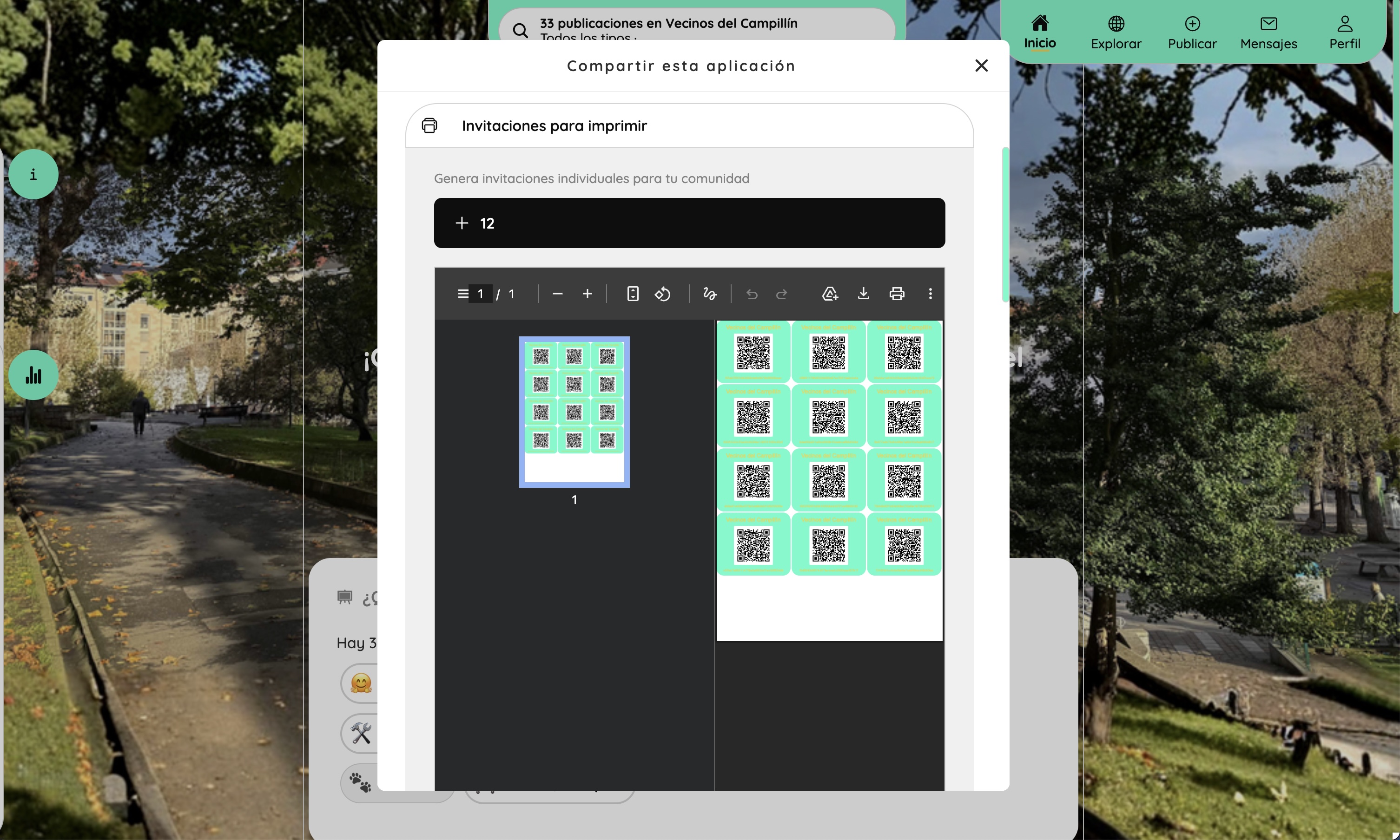
The invitation card generator produces a print-ready PDF sheet of QR cards — multiple cards per page, ready to cut and hand out at events, noticeboards, or community spaces. Each card is a personal credential: scanning the QR lets the user log in to the network directly, with no email address or password required.
Share network content — print the current button list as a PDF bulletin, embed the network in an external website using an iframe, or subscribe to the network's RSS feed to follow new publications through any feed reader or social media tool.
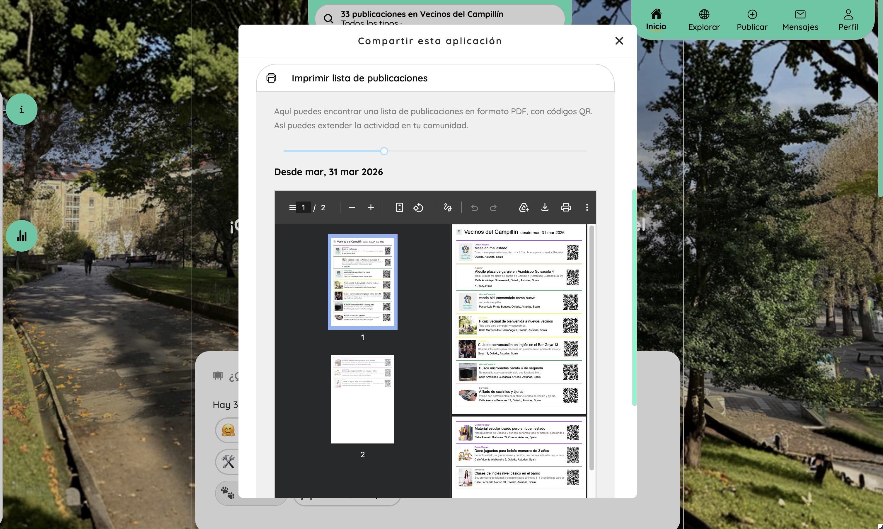
The PDF bulletin export generates a paginated document listing current buttons with their title, type, description, location, and a QR code linking to each one. Useful for printing and distributing in physical spaces — community centres, noticeboards, assemblies — reaching people who may not use digital tools.
FAQ / Legal#
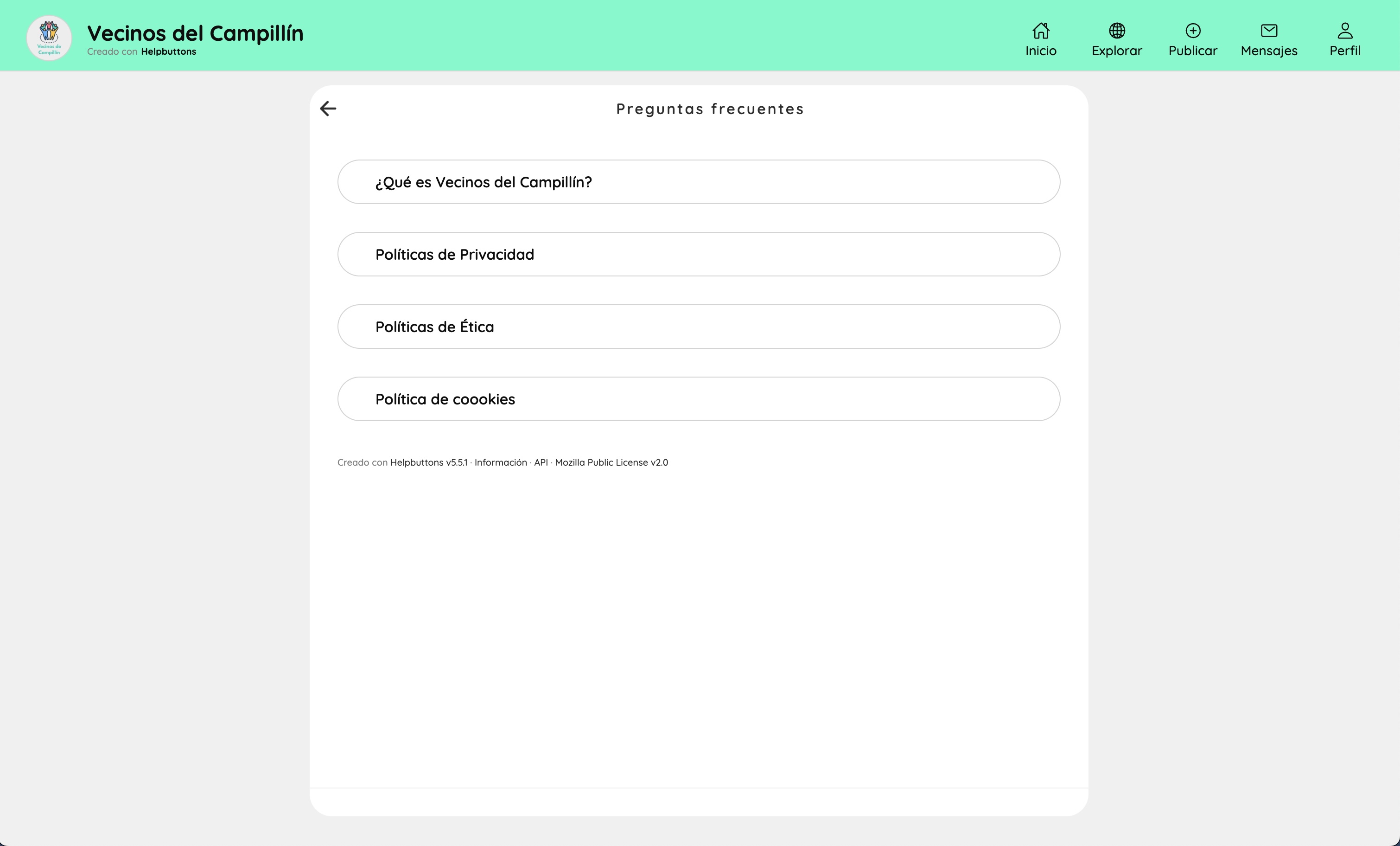
The public FAQ and legal information page. Displays the network's description ("What is this network?"), privacy policy, ethics policy, and cookie policy — all written by the coordinator in the network configuration. The page footer shows the Helpbuttons version and the Mozilla Public License.
Network configuration (coordinator)#
All configuration pages are reached from Profile → Configure your Network. Changes take effect immediately.
Configuration overview#
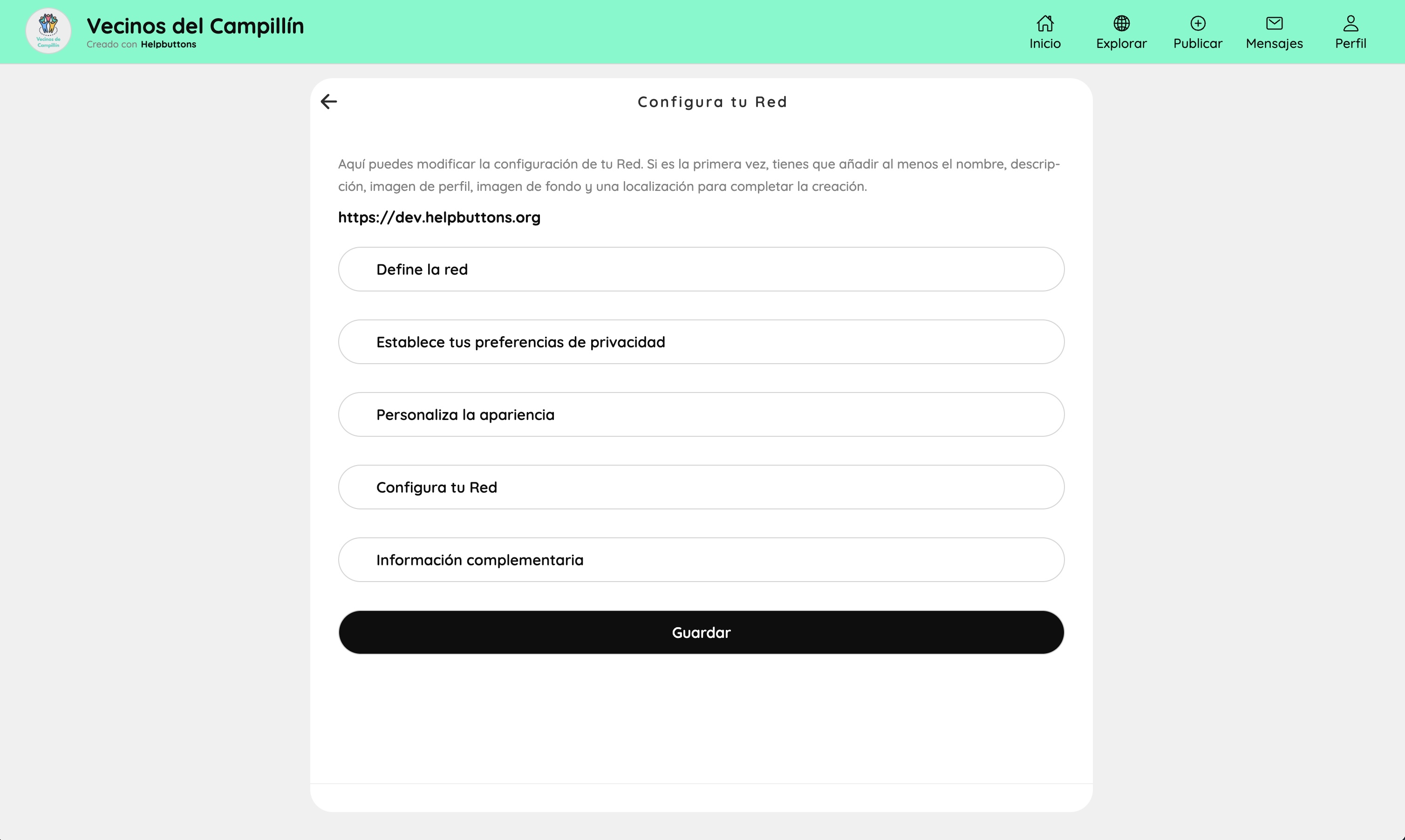
The top-level configuration panel. All settings are grouped into five sections: Define the network (name, description, location), Privacy preferences, Appearance, Configure your network (location, key places, tags), and Supplementary information (legal texts, contact). A single Save button at the bottom applies all changes.
Privacy settings#
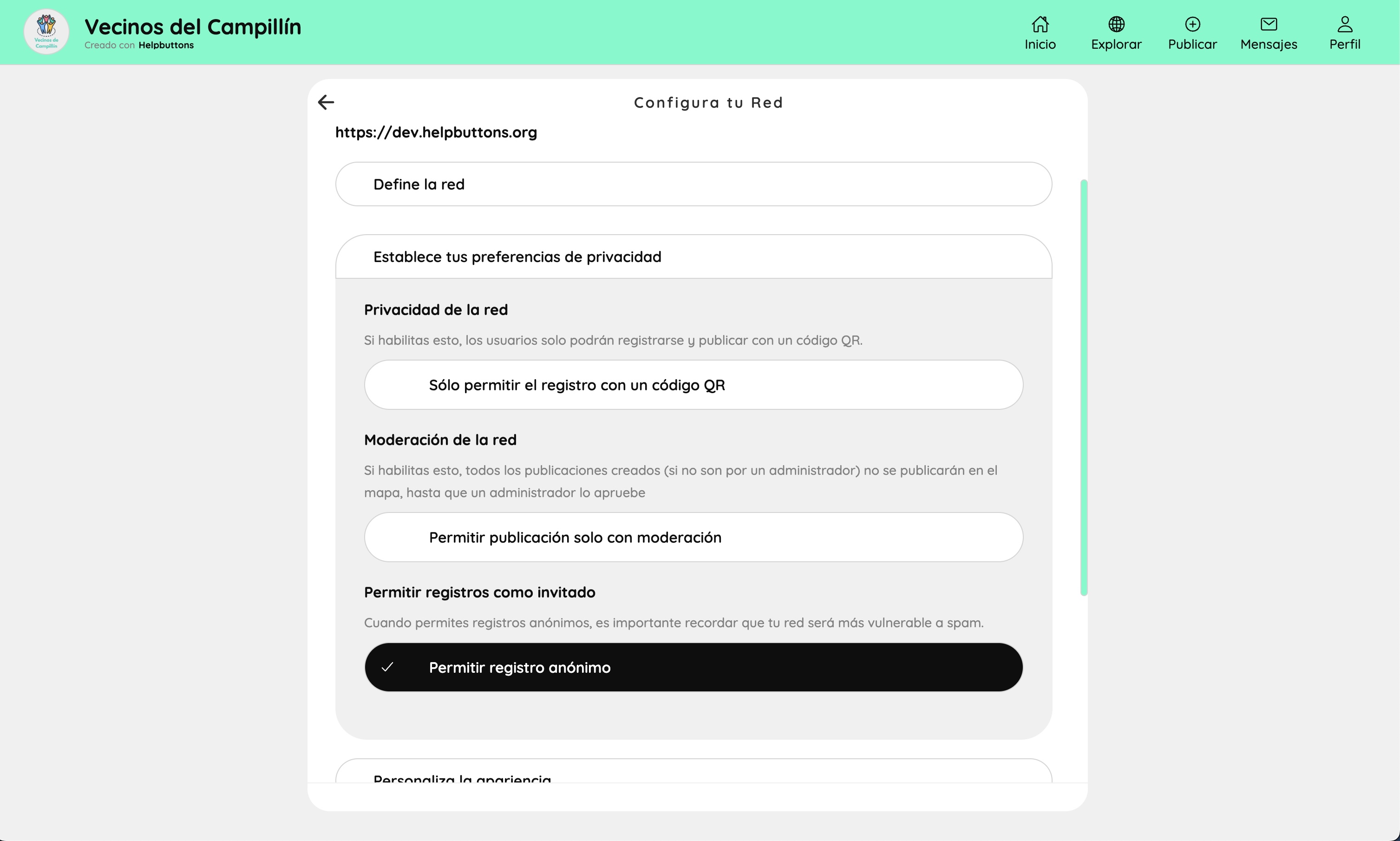
Controls three key access policies:
- QR-only registration — when enabled, users can only register by scanning a QR invitation card, no open sign-up.
- Moderation — when enabled, all buttons submitted by non-coordinators are held for review before appearing on the map.
- Anonymous registration — allows users to join without an email address, useful for low-barrier community tools (comes with a spam risk warning).
Appearance#
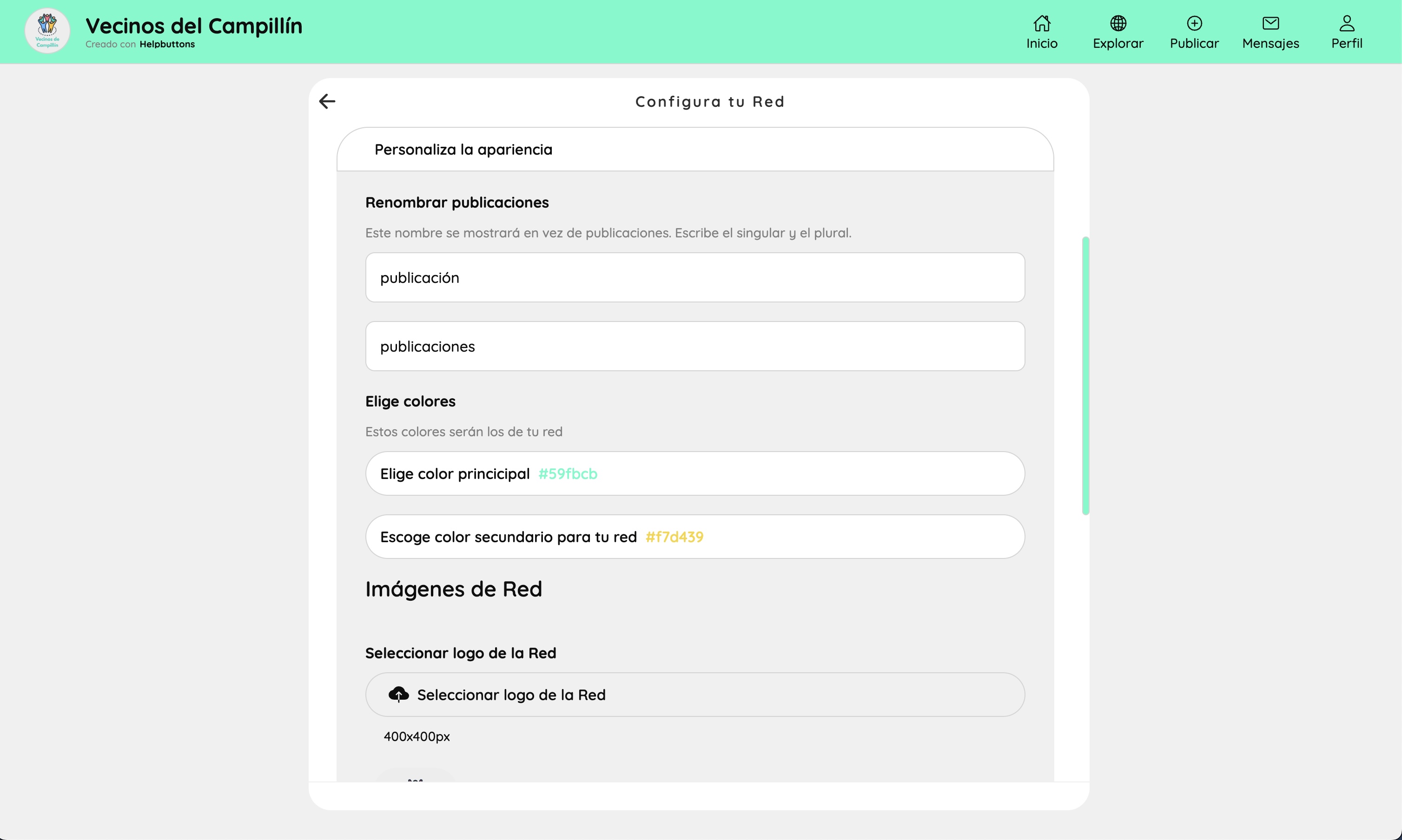
Visual identity of the Network. Coordinators can rename what a "button" is called (singular and plural) so the interface speaks the community's language. Primary and secondary brand colours are set here (hex values). The network logo (400×400 px) and a background header image are uploaded in this section.
Network location and key places#
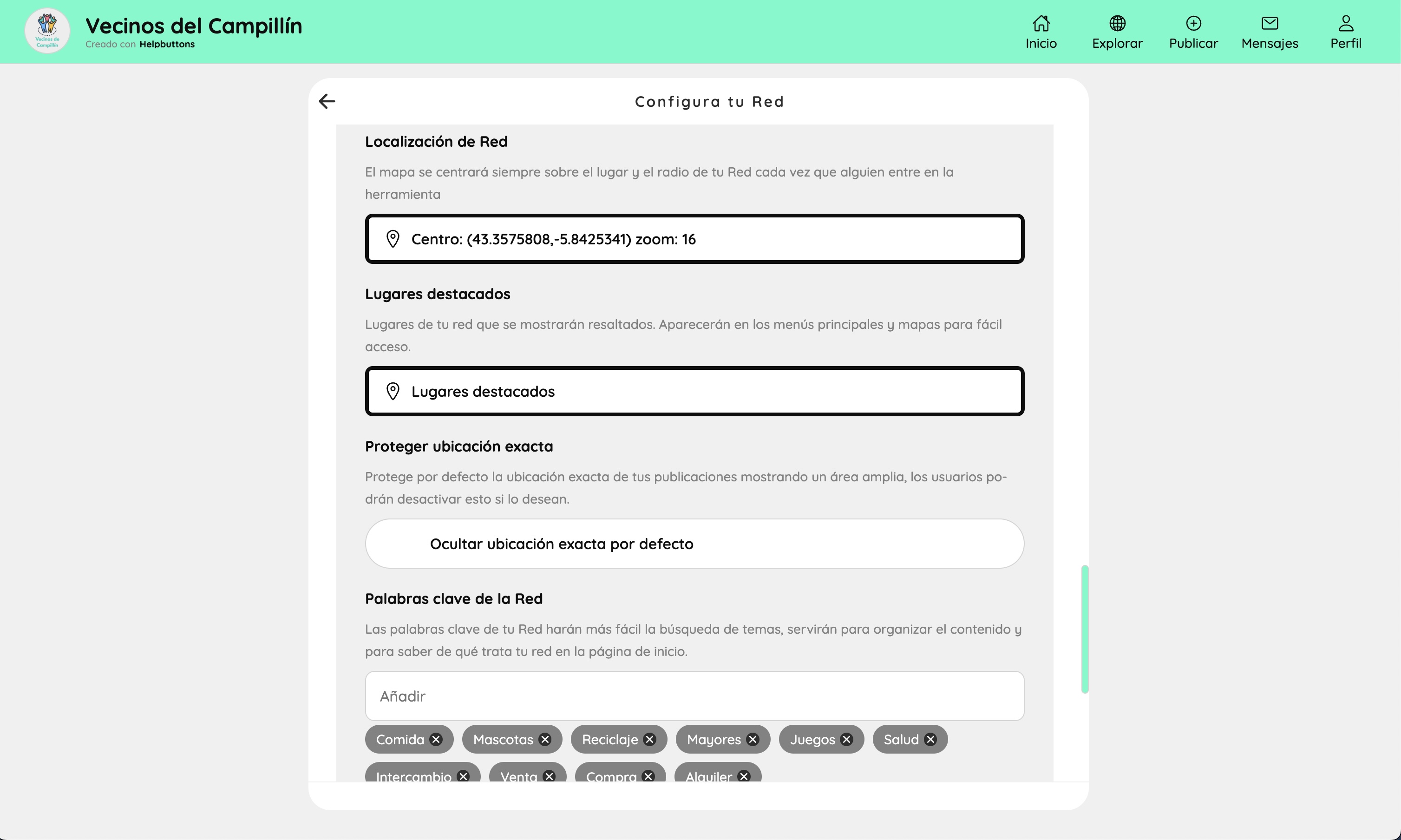
Sets the geographic centre and default zoom level of the map — this is where the map snaps to every time someone opens the network. Coordinators can define key locations (named landmarks visible as special markers on the map), toggle whether exact button locations are hidden by default, and set the network's recommended tags shown on the home page.
Location picker#
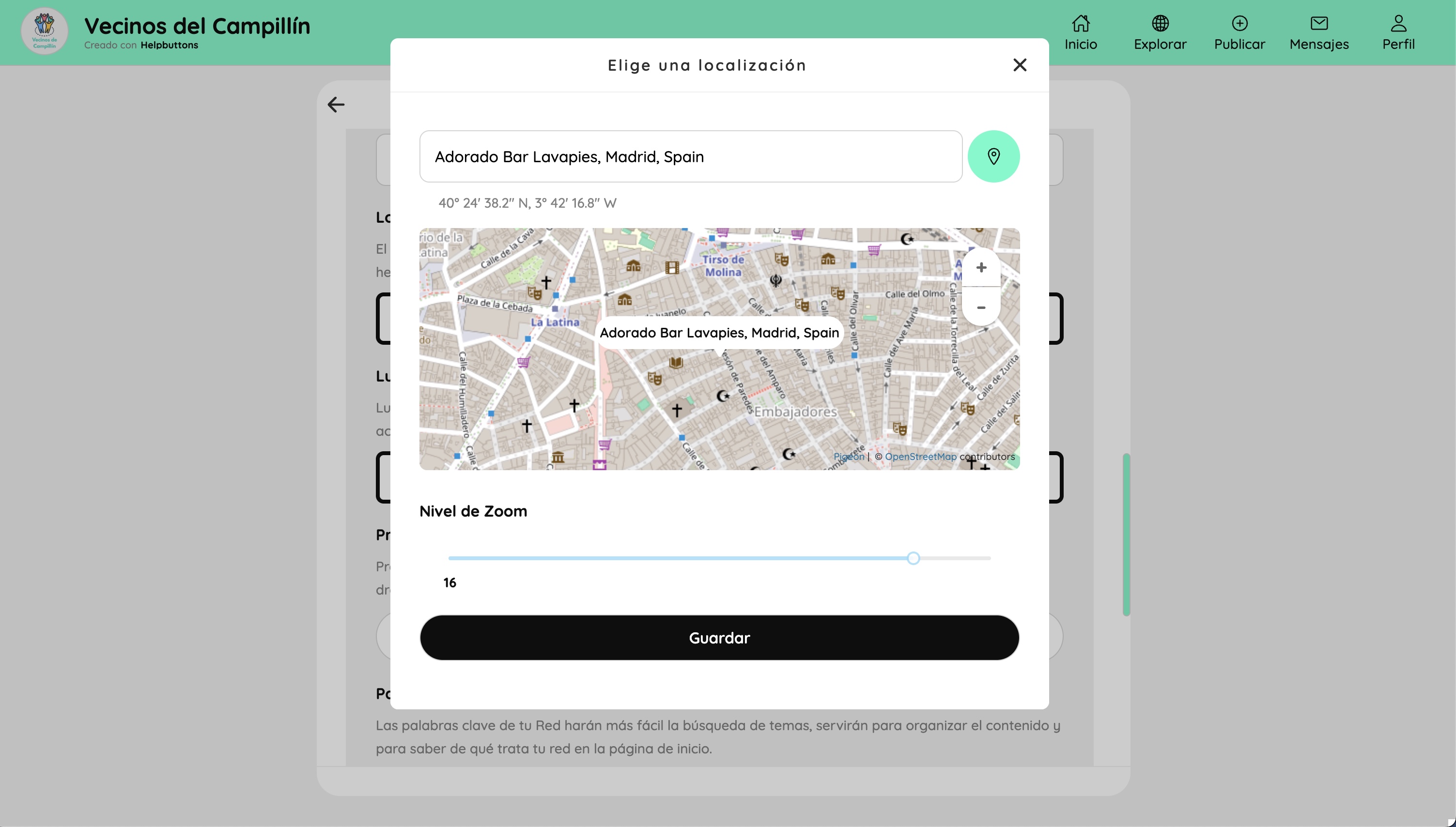
The location picker modal used when setting the network centre or adding a key location. Coordinators type an address or click on the map to place a pin, and adjust the default zoom level with a slider. Used both for the network's home location and for each individual key place.
Button template list#
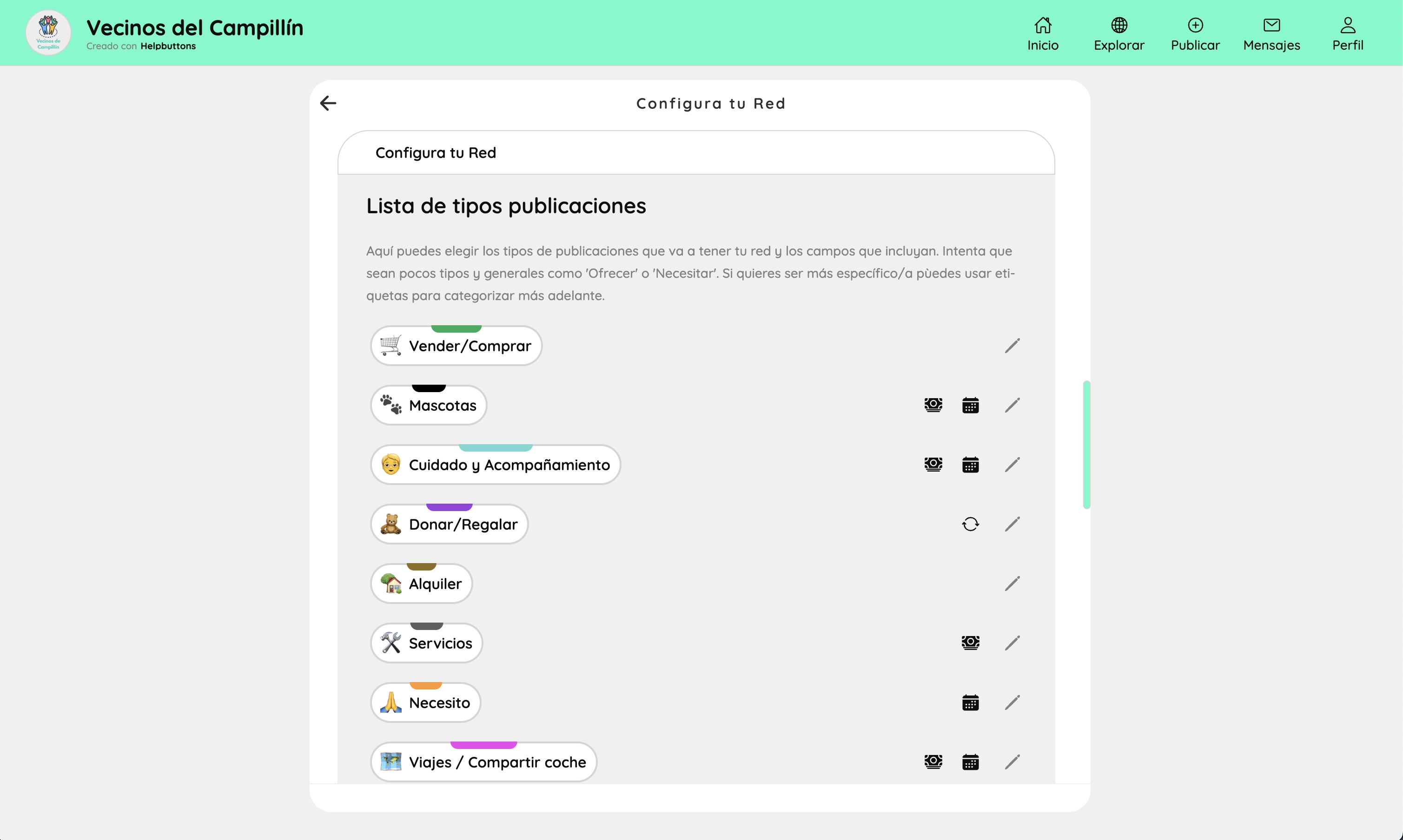
The list of all button types defined for this Network. Each type shows its label, emoji icon, and colour band. Icons on the right indicate whether the type has extra fields (price, date, scheduler). Coordinators can edit any type or add new ones.
Button template editor#
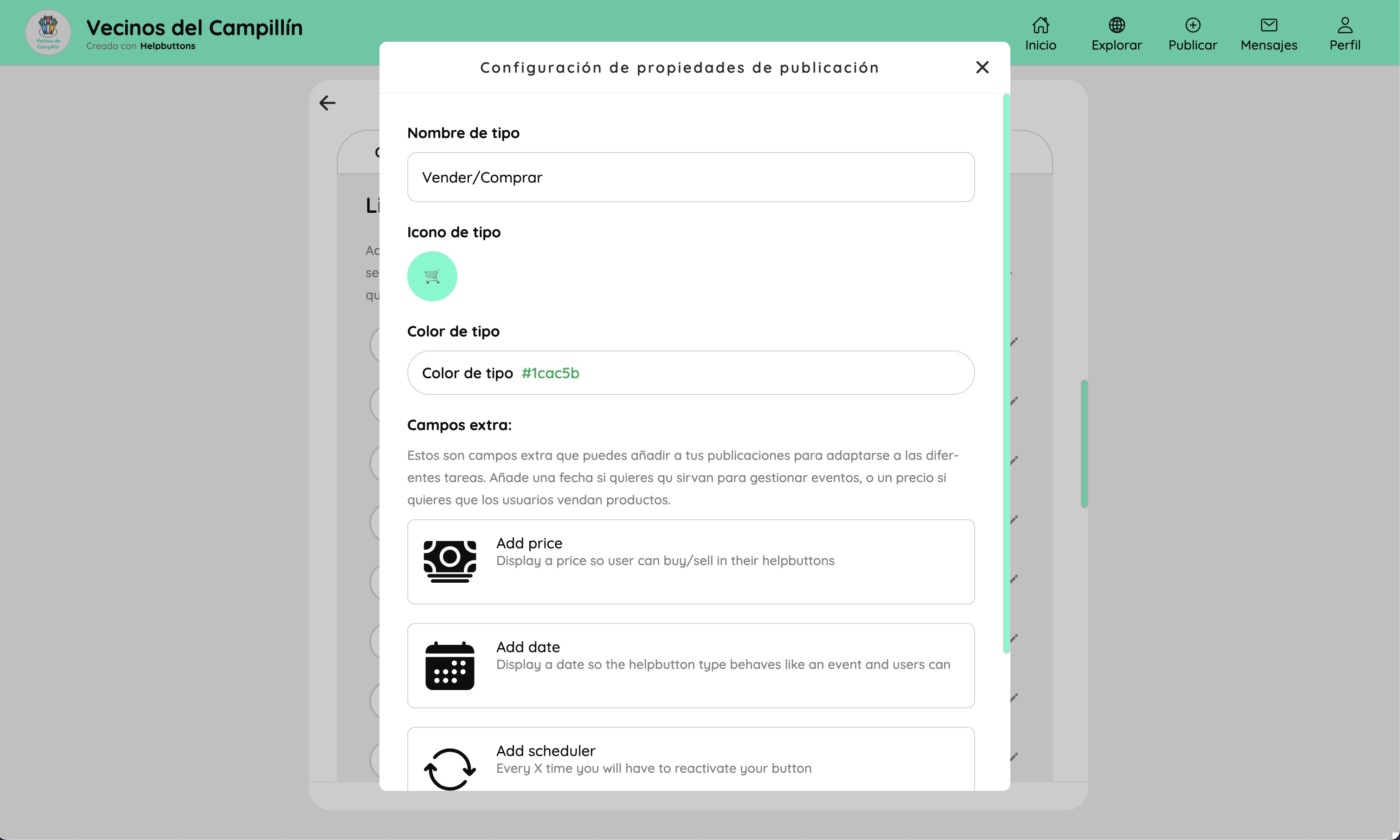
The editor for a single button type. Coordinators set the type's name, icon (emoji), and colour. Below that, optional extra fields can be toggled on: Add price (enables buy/sell display), Add date (turns the type into an event type), Add scheduler (sets an automatic reactivation reminder). These extra fields appear in the publish form and as filters on the Explore page.
Supplementary information#
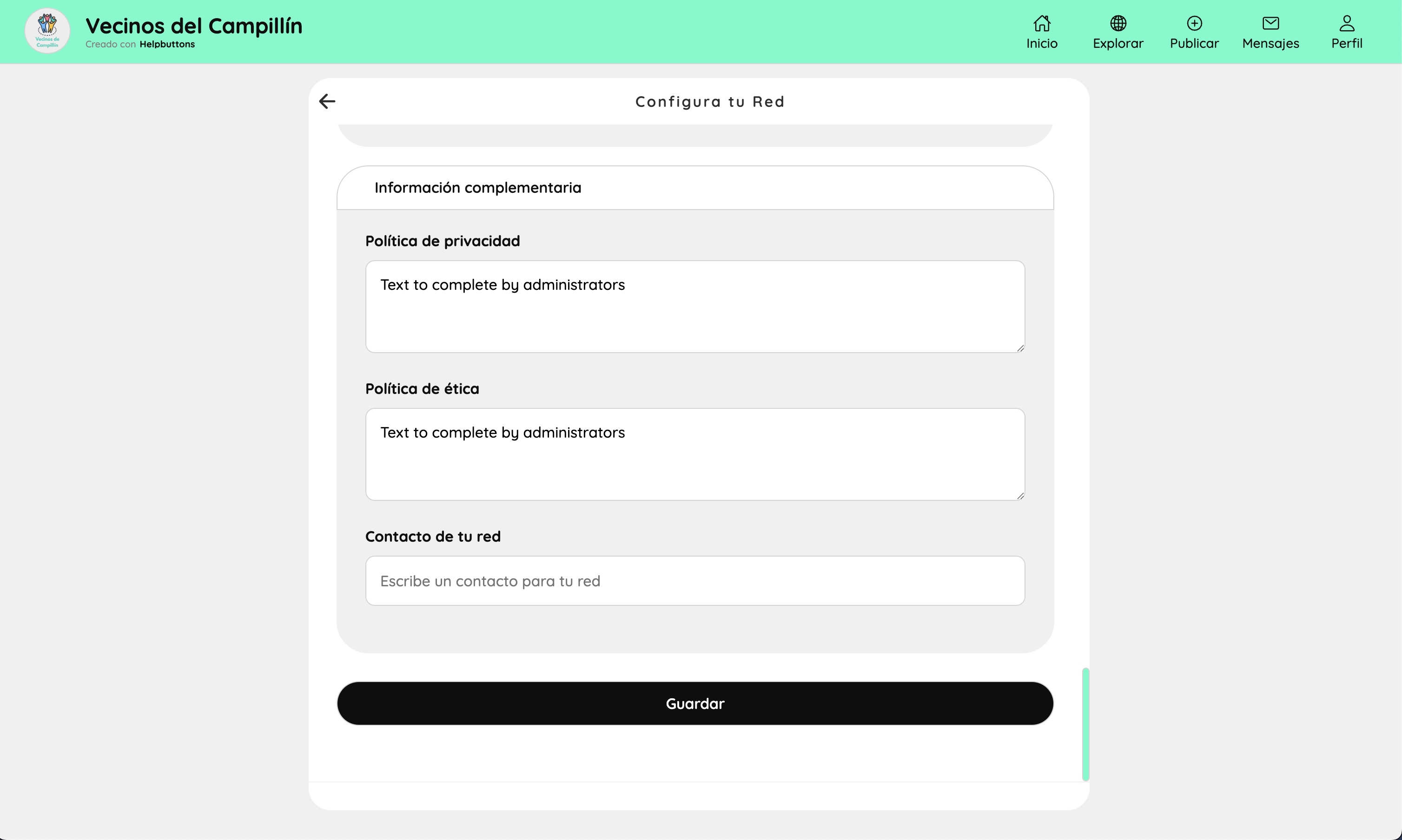
The legal and contact section. Coordinators write the network's privacy policy and ethics policy in free-text fields. These texts are shown publicly on the FAQ page. A contact field allows publishing an email or phone number visible to all members.
Moderation (coordinator)#
Moderation panel#
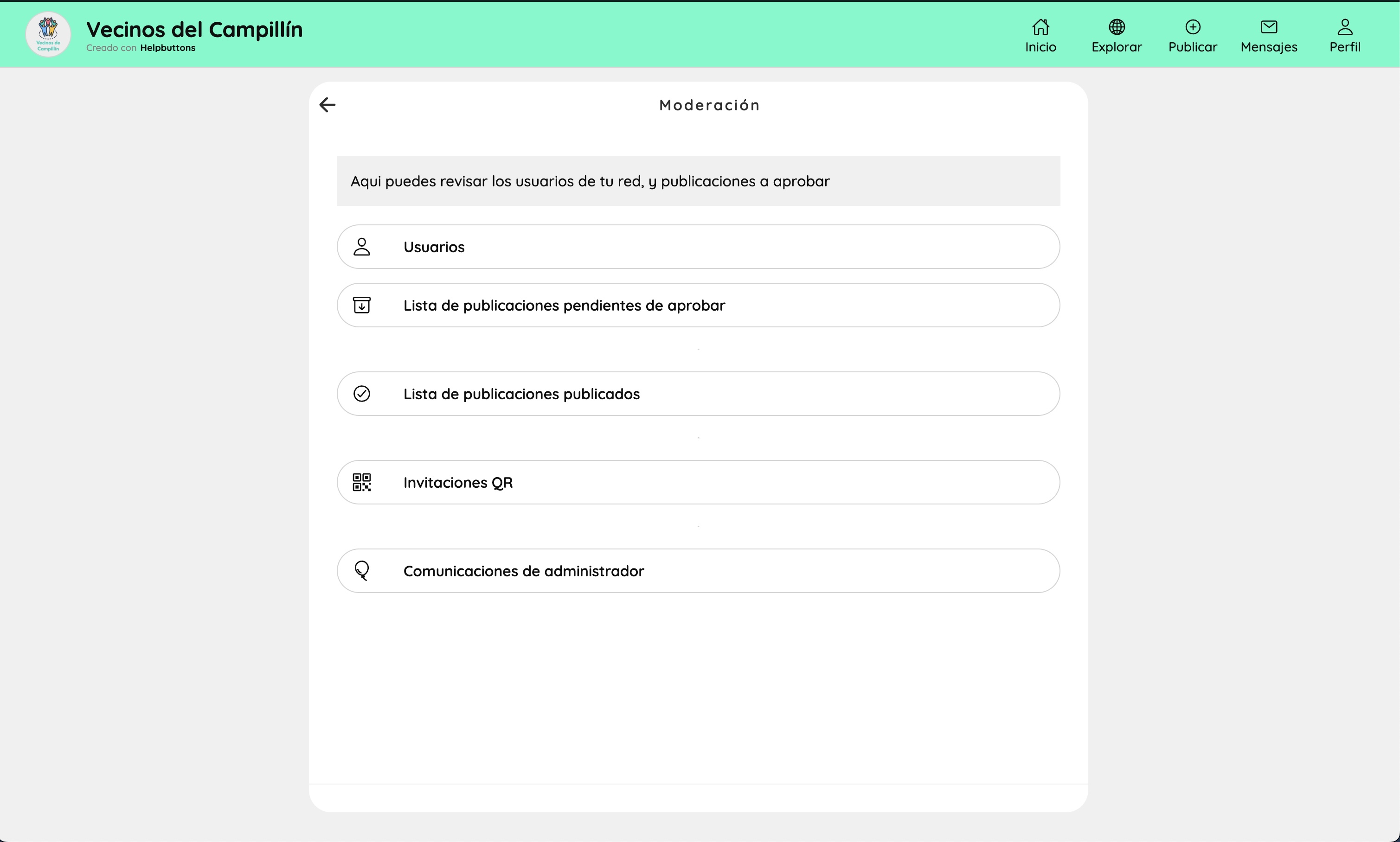
The moderation hub, accessible from the profile page. Sections: Users (manage accounts, block users), Pending buttons (buttons awaiting approval if moderation mode is on), Published buttons (full searchable list of all live buttons), QR Invitations (generate and manage invite codes), Coordinator communications (broadcast messages to the community).
Button moderation list#
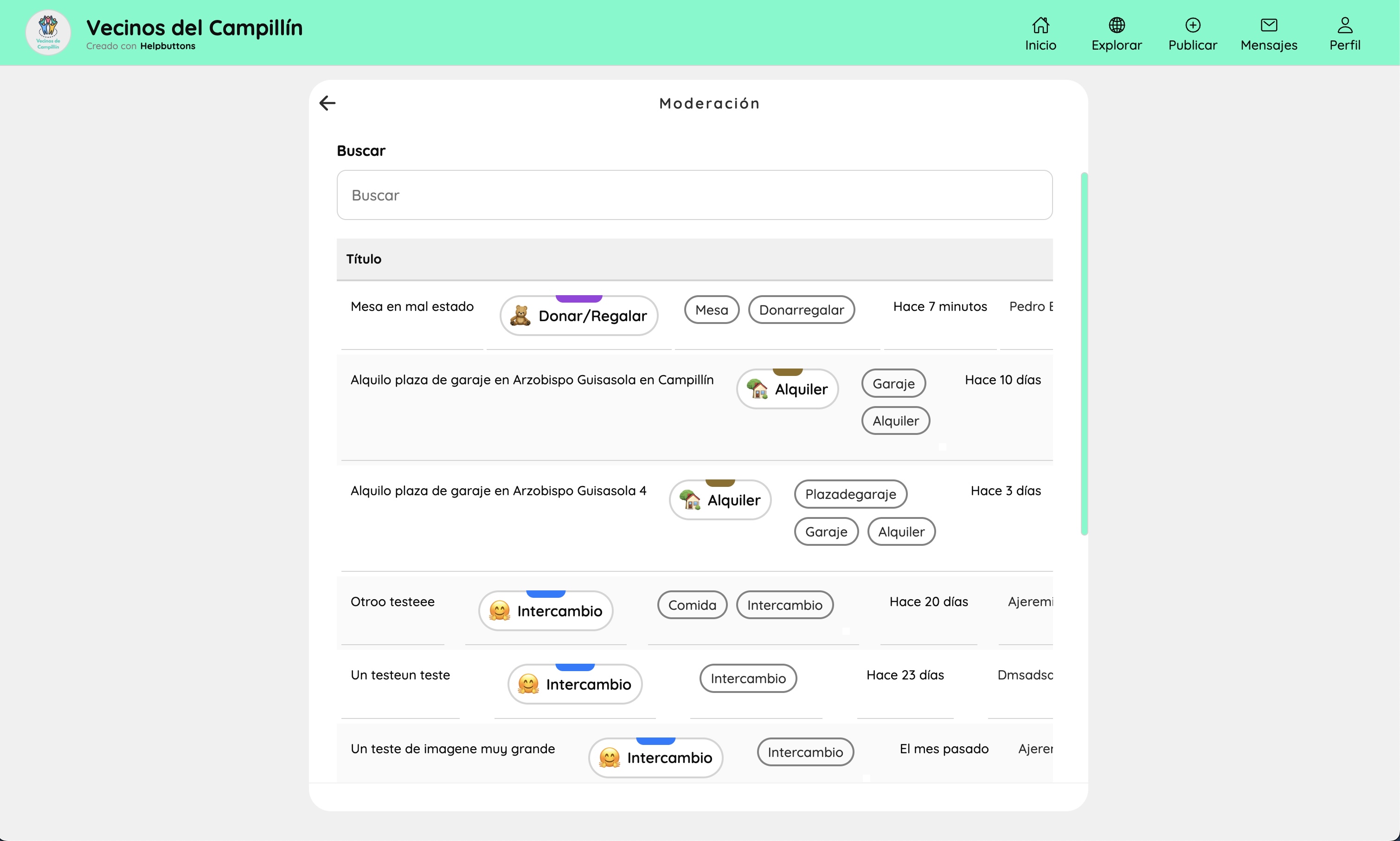
A searchable table of all published buttons. Each row shows the title, type badge, tags, time since posting, and author. Coordinators can open any button from here to review, edit, or remove it.
QR invitations#
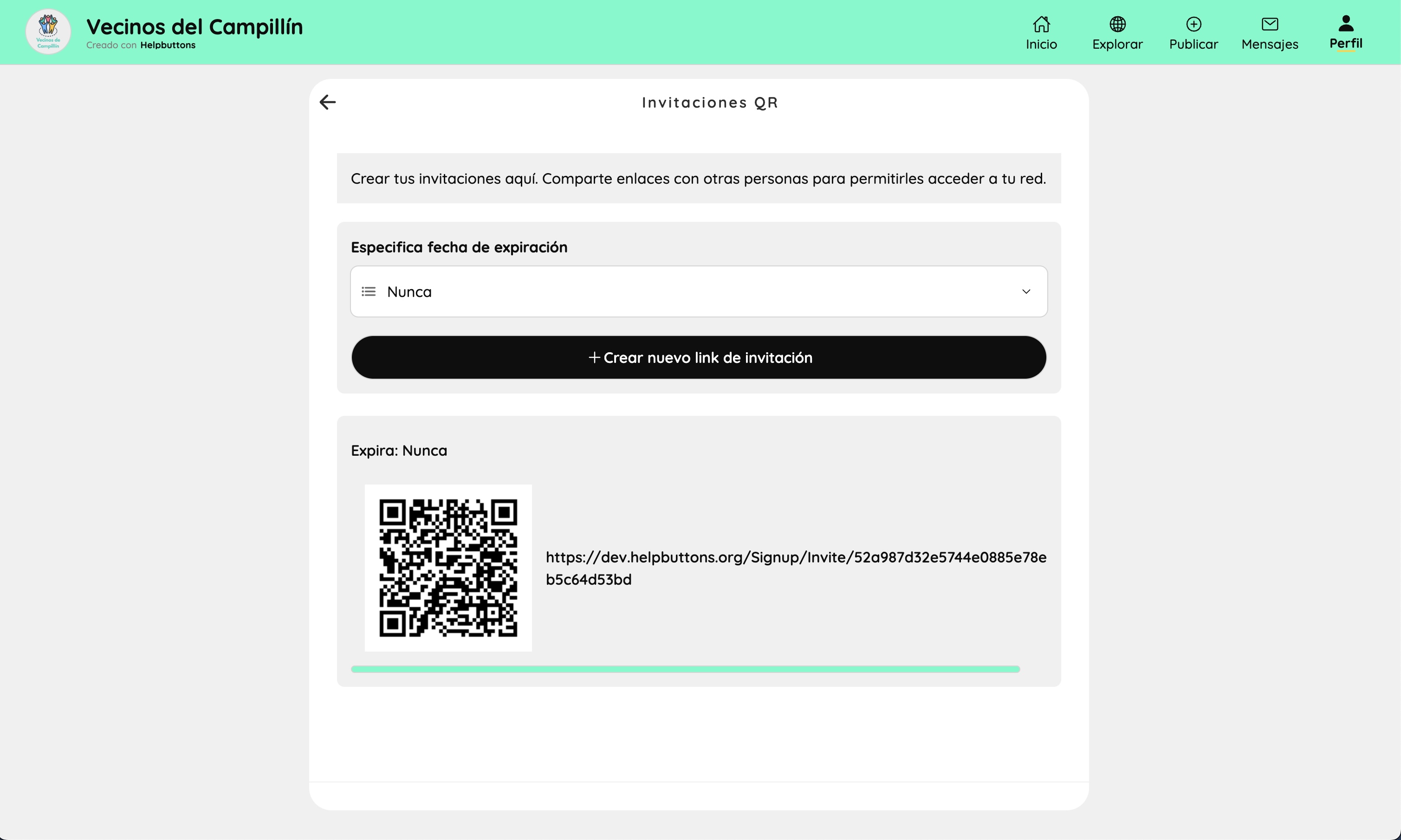
Generates invitation cards with optional expiry dates (day, week, month, or never). Each card is rendered as a QR code and a plain URL. The QR acts as a personal credential — scanning it logs the user into the network directly, with no email address or password required. Cards can be printed and distributed physically or shared digitally.